

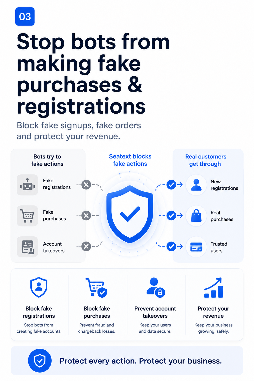
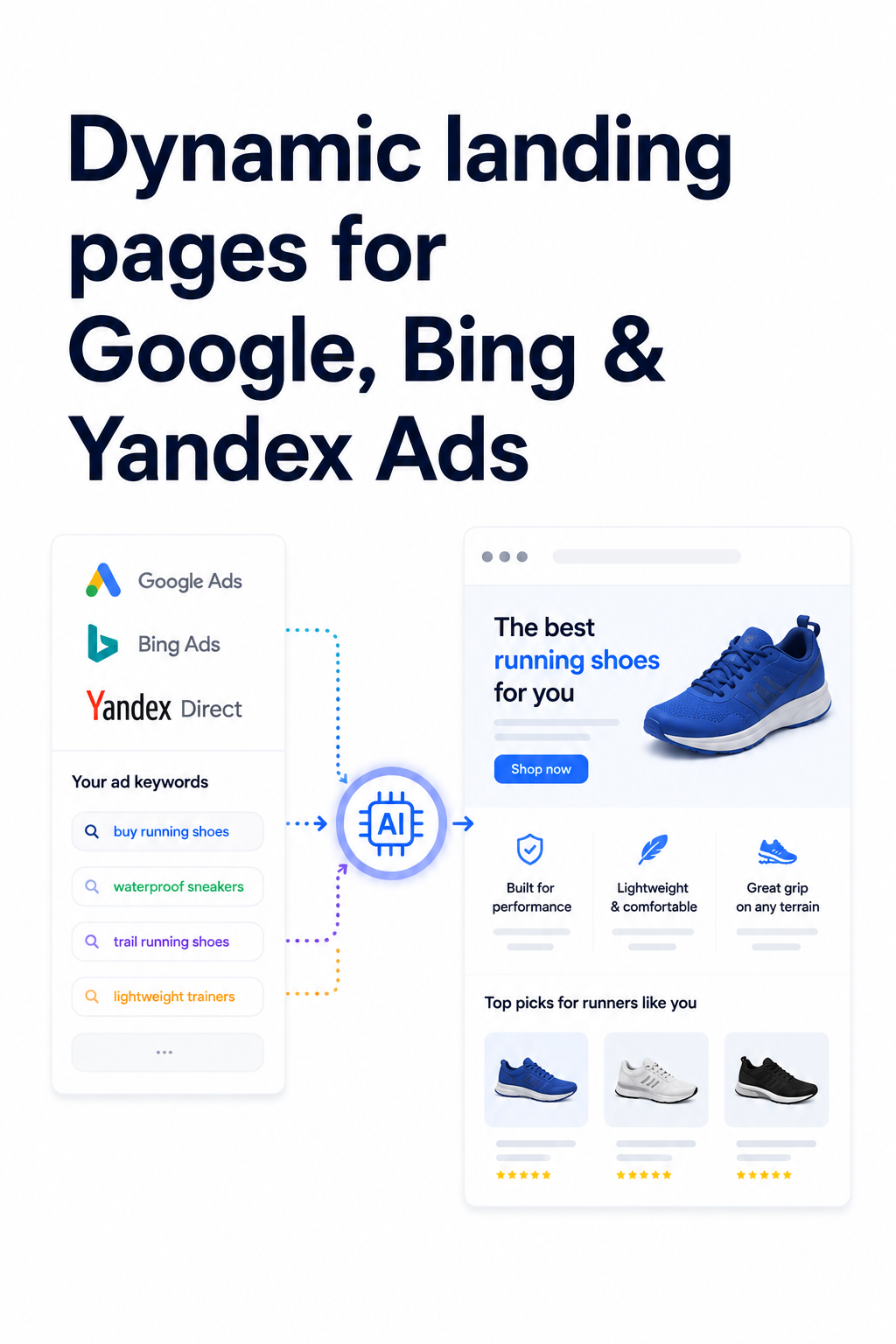
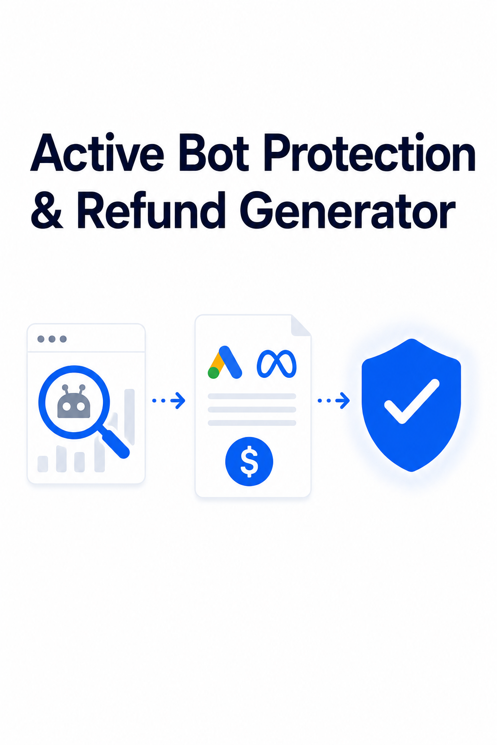
01 / Google Ads Landing Page Agent
Get up to 0 more conversions from your Google Ads campaigns.
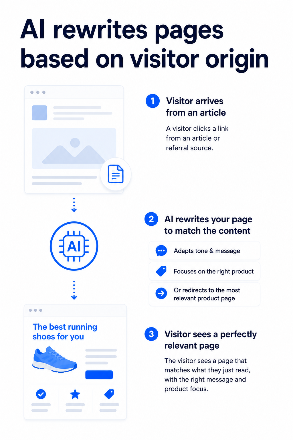
Seatext reads the campaign, keyword, and visitor intent behind each paid click, then adapts headlines, offers, product blocks, and CTAs so the page feels built for that search.
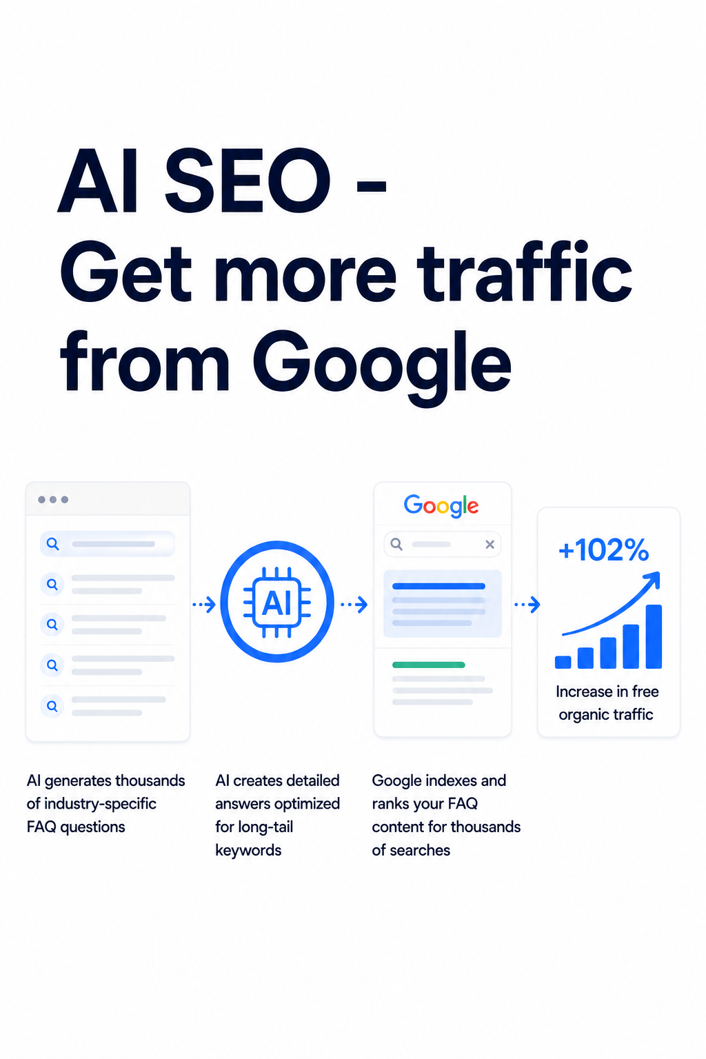
What this AI agent does
This AI agent reads each ad keyword and rewrites headlines, offers, product blocks, and CTAs to match that visitor's intent.
- Keyword-aware headline and CTA rewrites
- Campaign-specific product and offer adaptation
- Conversion reporting by page, keyword, and variant
